Interview design assignment
Overview
As part of the interview process for a Digital Designer role at Cookology, I was asked to create one or two paid social ad creatives for the brand. The brief was open — product, category, sale message, or brand — with creative freedom on direction and style. I used the Cookology website as my reference and had around a week to deliver.
Approach
Before opening Figma, I spent time on the Cookology site to get a feel for the brand. Their product range spans kitchen appliances at accessible price points — wine coolers, dishwashers, range cookers — and their tone sits somewhere between practical and aspirational. They’re not a luxury brand, but they’re not purely functional either. That middle ground felt like the interesting creative space to work in.
I decided to submit two ads, using them to show two distinct creative approaches rather than two versions of the same idea.
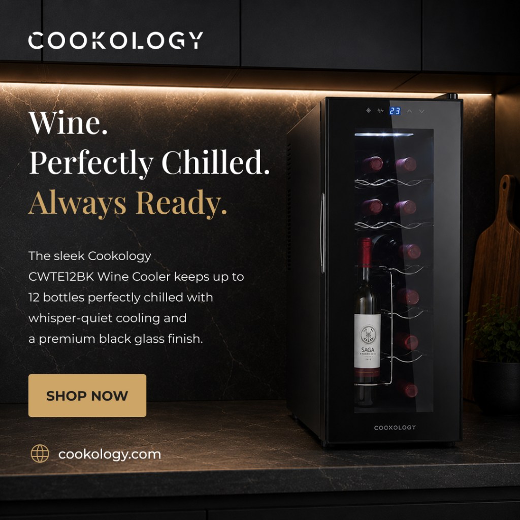
Ad 1 — Wine Cooler (Premium lifestyle)
For the first ad I chose the CWTE12BK wine cooler and leaned into a premium aesthetic. Dark marble kitchen photography, warm underlighting, and a stacked serif-style headline — “Wine. Perfectly Chilled. Always Ready.” — with a gold accent on the final line. The goal was to make an everyday product feel like a considered purchase. The “Shop Now” CTA uses a muted gold button rather than a bright colour, keeping the mood consistent rather than breaking it with something jarring.
The layout is built for Meta square format — logo top-left, headline anchored left, product right, URL bottom-left. Everything is readable at small sizes and the visual hierarchy holds up in-feed without needing to be loud.
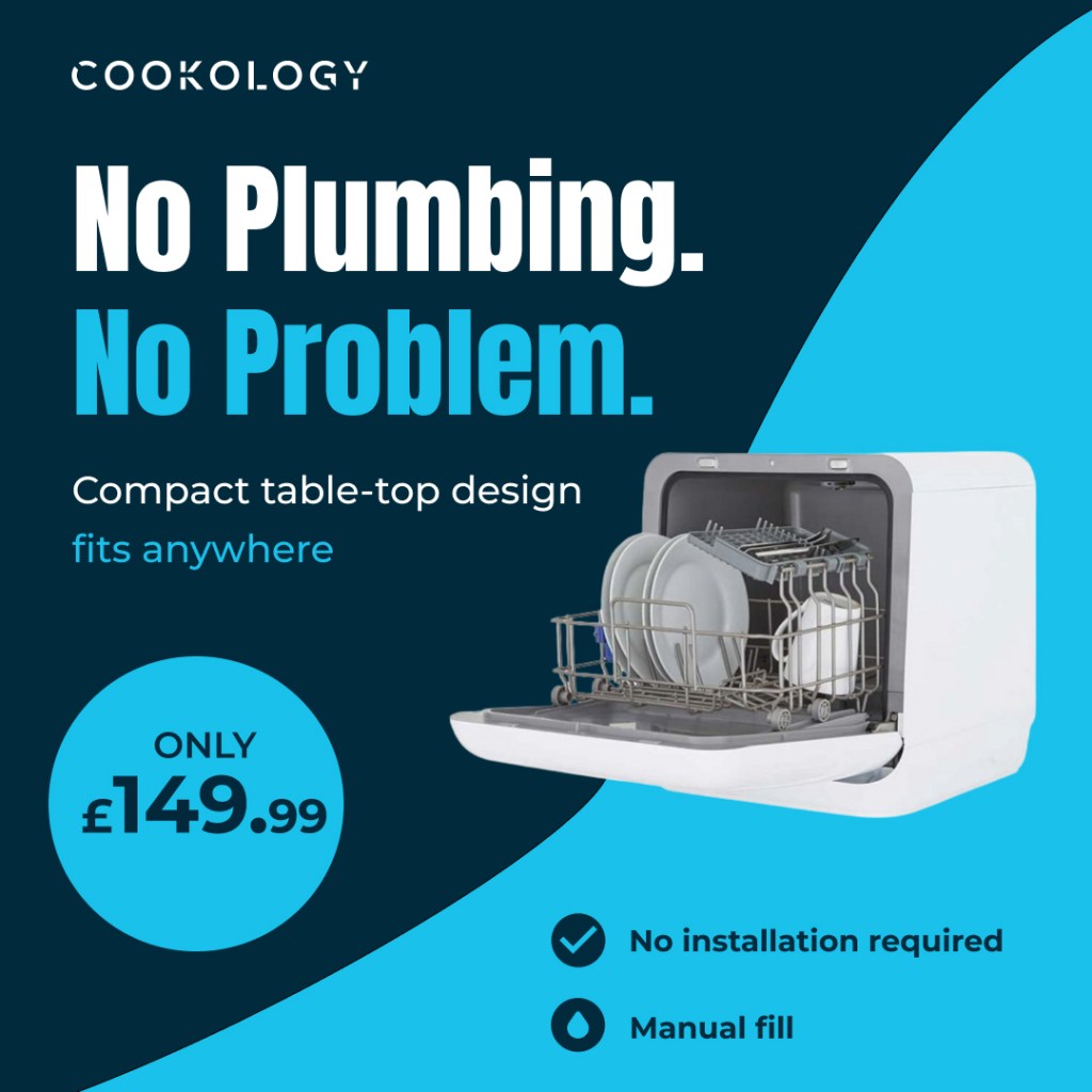
Ad 2 — Countertop Dishwasher (Bold and direct)
The second ad takes a completely different approach. The countertop dishwasher is a practical, problem-solving product — no plumbing required, compact, affordable — so the creative leans into that directly. High-contrast navy and cyan, a heavy sans-serif headline (“No Plumbing. No Problem.”), a price callout in a circular badge, and two quick benefit icons at the bottom.
Where the wine cooler ad tries to create desire, this one removes doubt. The two ads together show I can shift between a mood-led and a message-led approach depending on what the product and audience need.
Reflection
If I were taking these further, I’d want to test a few things — the CTA copy on the wine cooler ad, whether the price badge on the dishwasher ad helps or cheapens the feel, and whether a lifestyle background on ad two might outperform the graphic treatment. For a brand like Cookology, where the product range is broad and the audience spans renters, first-time buyers, and home enthusiasts, having a flexible creative approach feels more valuable than a single locked-down style.