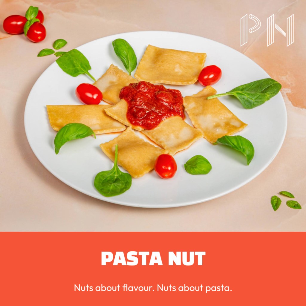
My own startup, and I was its whole marketing department. Pasta Nut is the handmade pasta business I launched in South-East London in March 2025: fresh ravioli and tagliatelle on Deliveroo and Uber Eats, and a frozen range for delis and shops. No agency, no marketing team. Everything with a design or a word on it is mine: the brand, the packaging, the print, the website and the copy.
Role Founder, brand, web and copy · Platform WordPress.com · Year 2025 · Site pastanut.uk
The situation
I had the recipes and a launch date. Nothing else existed: no logo, no packaging, no website, no menu copy, and no budget to pay anyone for them.
The food was the point of difference. Cashew ricotta ravioli, nut pestos, plant-based options always on the menu, and a deliberately irreverent take on Italian pasta. The brand had to carry that in three places with almost nothing in common: a thumbnail tile in a delivery app, a label on a frozen pack, and a phone screen, because that is where people order dinner.
Three decisions
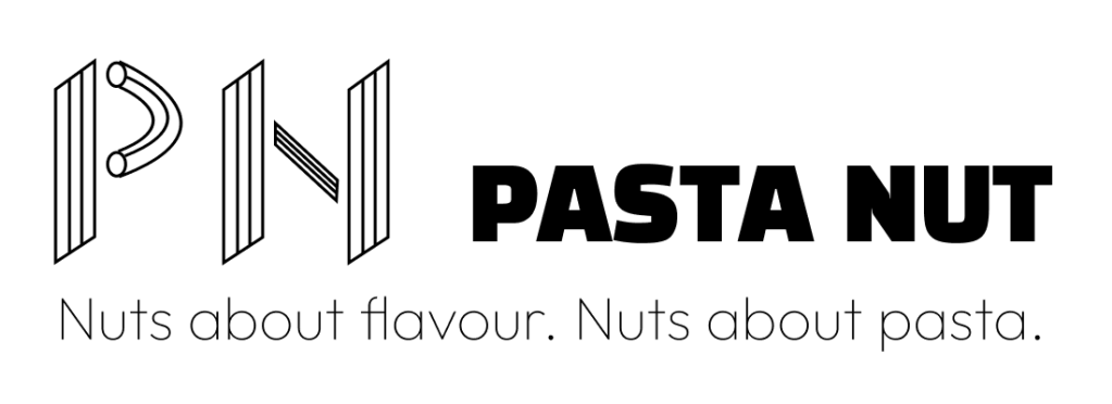
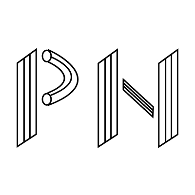
Letters made of pasta. The mark draws the P and the N as maccheroni and penne, in line. In a delivery app or an Instagram avatar there is room for two letters and not much else, so the mark had to read as pasta before anyone read the name. The square icon is that mark on its own.
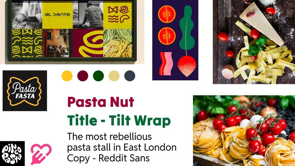
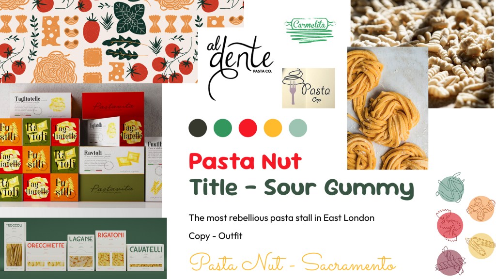
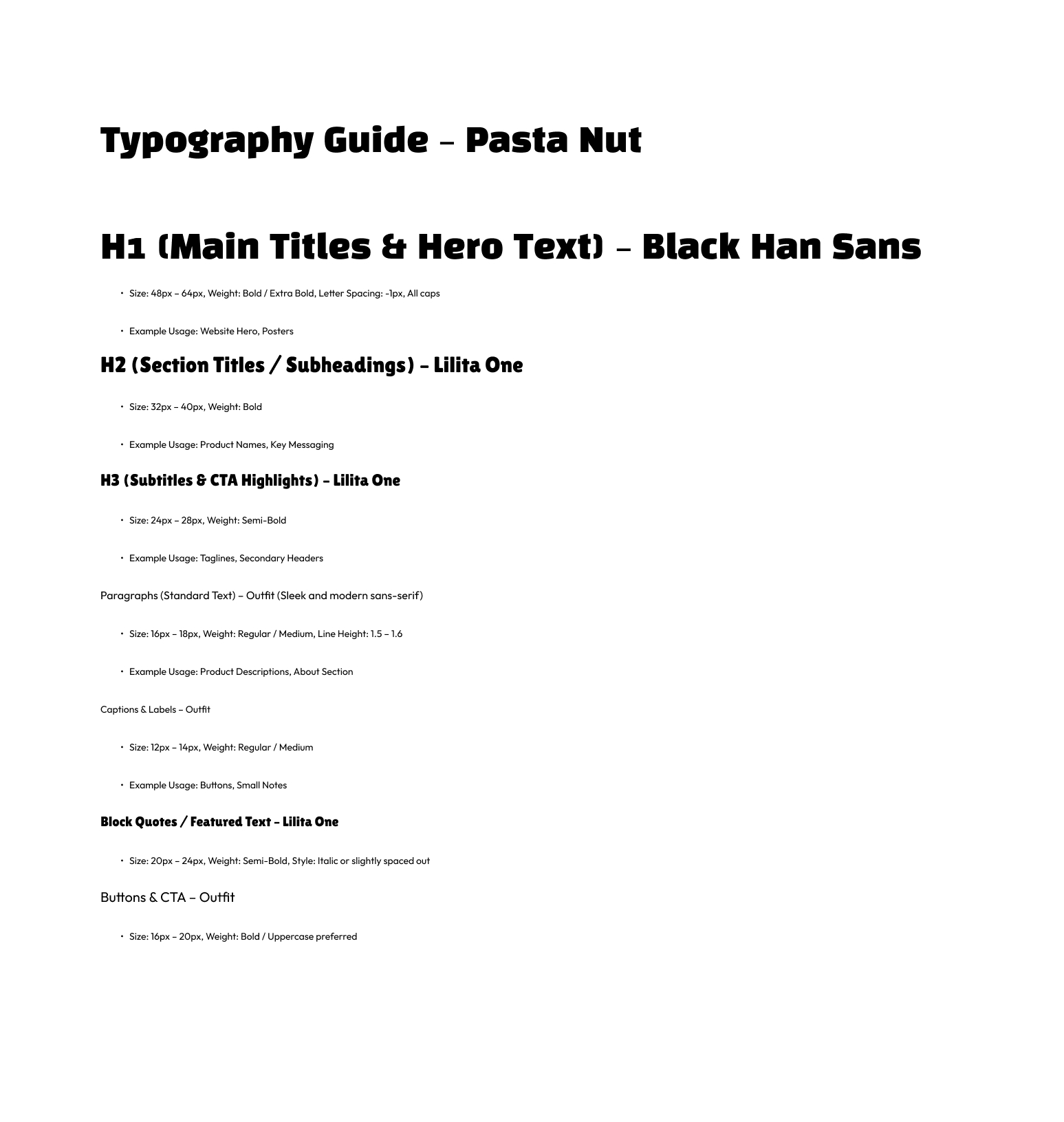
Neither moodboard, exactly. I started with two directions: playful and colourful, or traditional and retro. Retro is where most Italian food brands already sit, and a brand built on breaking the rules could not look like every deli in London. So the energy came from the playful board, with heavier headlines than either board proposed, Black Han Sans and Lilita One. One thing came from the retro board: Outfit for body copy, because it stays readable at the sizes a menu and an allergen list need.
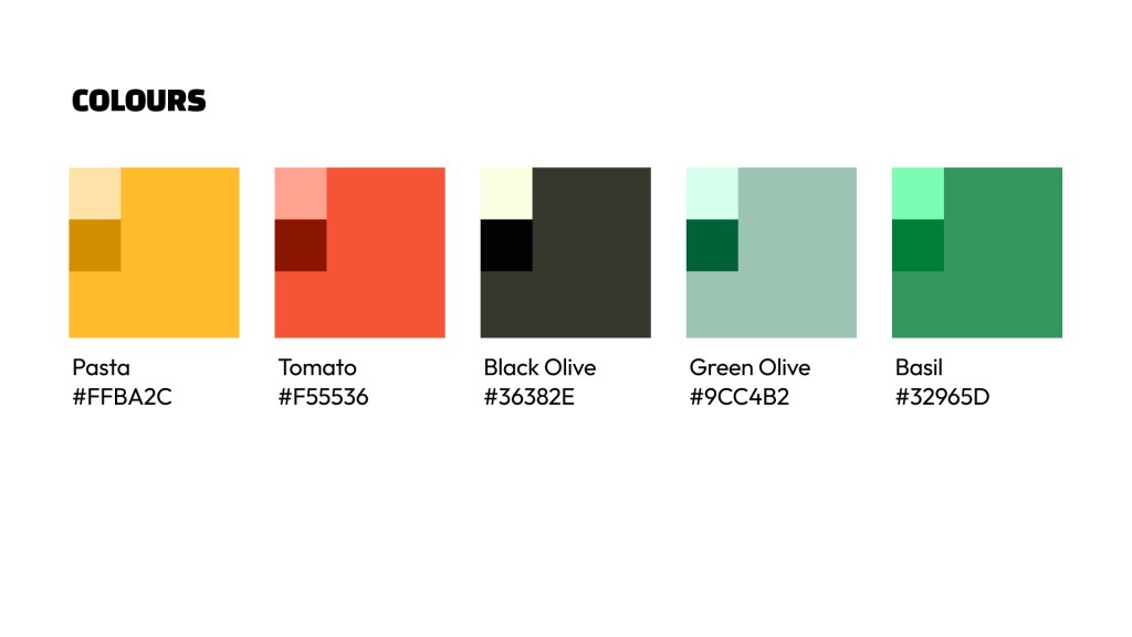
A palette from the pantry. Pasta, Tomato, Basil, Green Olive and Black Olive. Naming every colour after an ingredient kept the brand tied to the food and made it easy to use without a style guide open. The leaflet, the sales sheet, the social posts and the site all draw from the same five.
What I made
- Identity: two moodboards, the logo and square icon, the type system and a five-colour palette
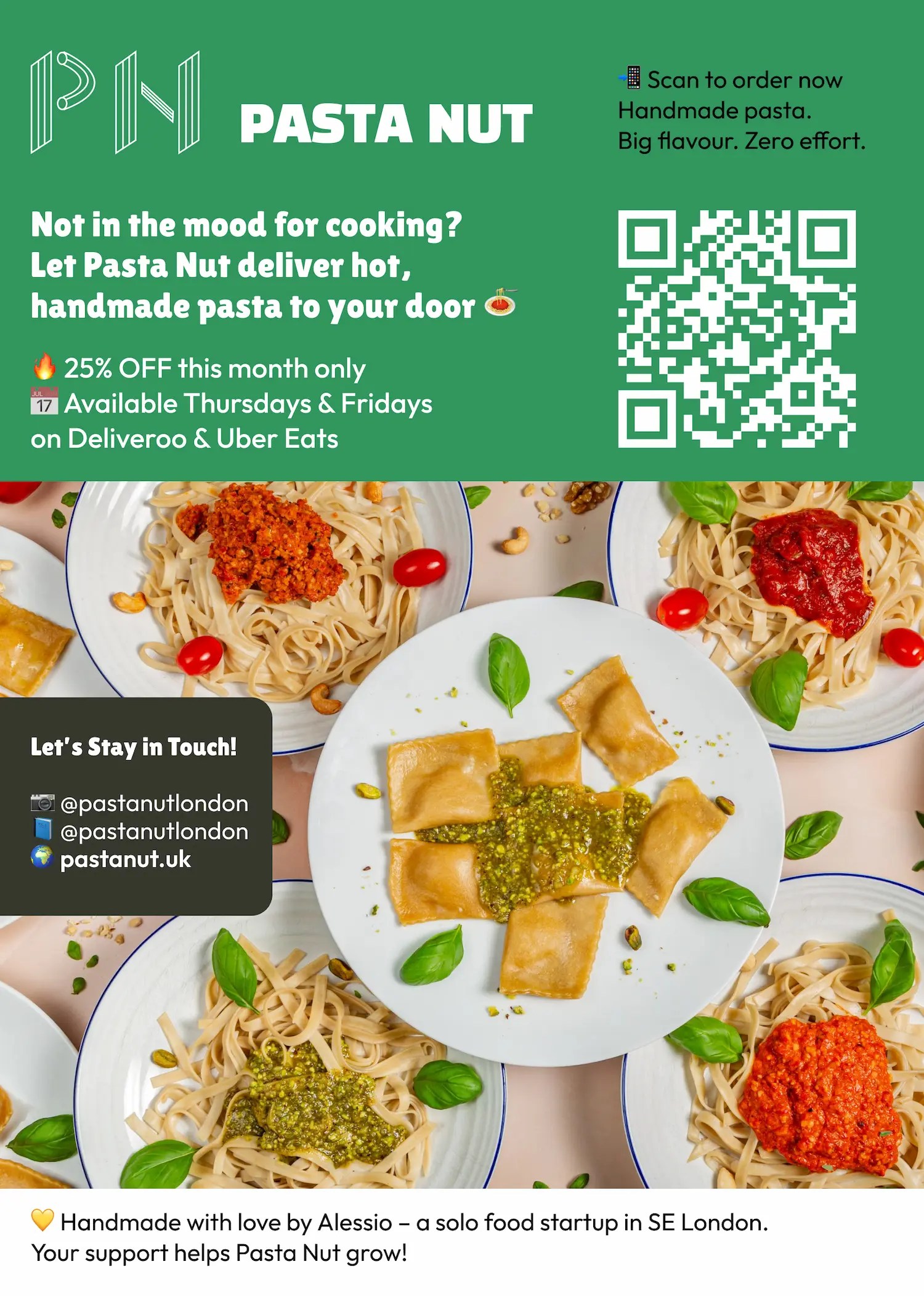
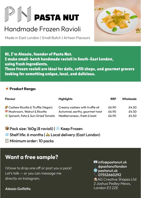
- Packaging and print: labels for the frozen ravioli range, an A5 delivery leaflet with a QR code and the 25% launch offer, and an A5 sales sheet pitching the frozen range wholesale to delis, refill shops and grocers
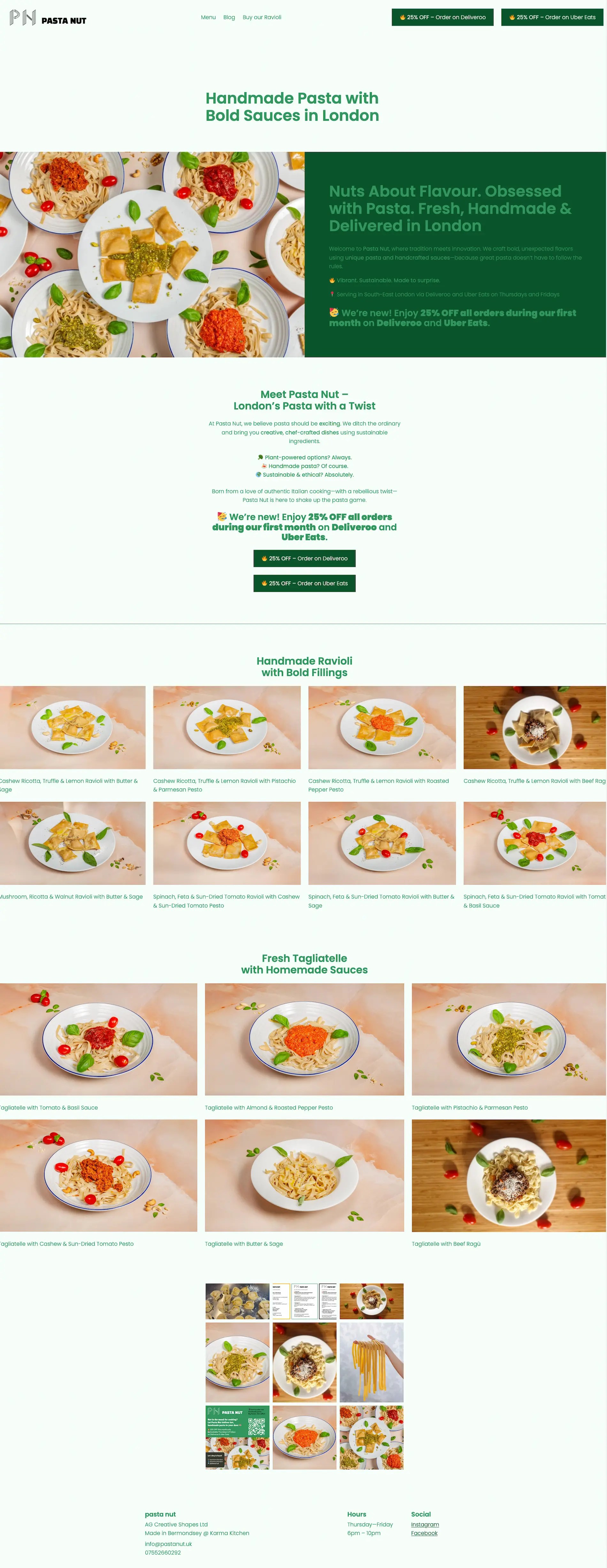
- Website: designed and built on WordPress.com: home, menu, blog and a product page for the frozen range, with order buttons straight to Deliveroo and Uber Eats
- Copy and content: every word on the site and menu, eight blog posts, and the organic posts on Instagram and Facebook
How the site was built
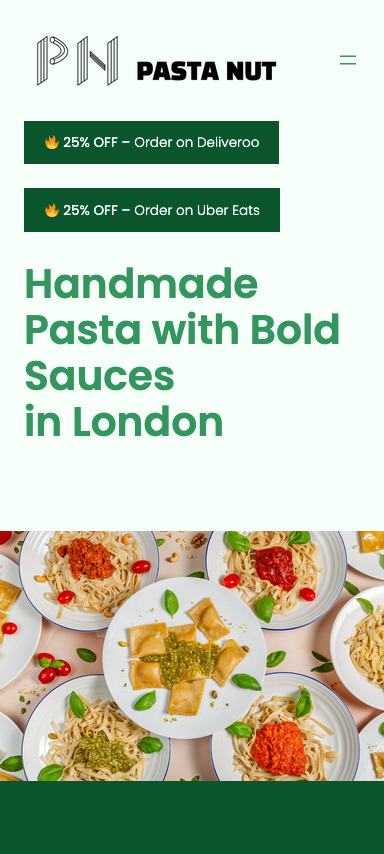
WordPress.com, on a block theme, no page builder. The home page runs in the order a hungry person needs it: the offer, what Pasta Nut is, the ravioli, the tagliatelle, then the Instagram feed. On a phone the two order buttons and the launch discount sit in the first screen, because a delivery customer decides there or not at all.
The site scores 100 for SEO and 100 for best practices in Google Lighthouse, with a cumulative layout shift of 0. Nothing moves under your thumb while the page loads.
The result
Pasta Nut launched in March 2025 across packaging, print, the site and social, and traded on Deliveroo and Uber Eats through the summer. It has been paused since, which is why pastanut.uk opens with a note saying so. The brand and the site are intact.
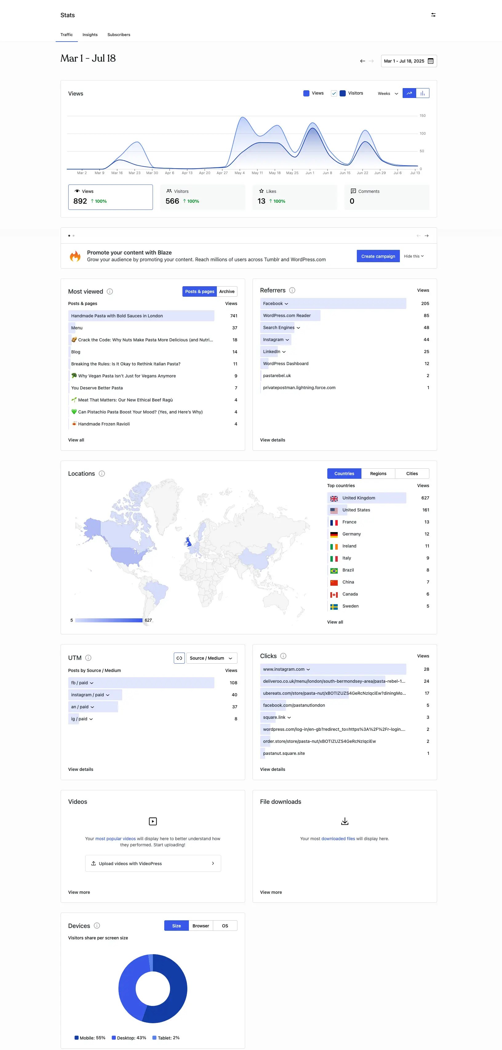
In its first four and a half months the site drew 892 views from 566 visitors, 55% of them on a phone, which is the split the design was built around. Facebook sent more traffic than search, Instagram and LinkedIn put together. After the home page, the most visited page was the one selling the frozen range.
The part I would point to is less measurable. With no budget and no team, the brand held together everywhere it had to, from a delivery app tile to a wholesale sales sheet, because one person built it as one system.
What I’d do differently
Accessibility, earlier. Lighthouse scores the site 89 for accessibility and flags two things: text contrast in places, and tap targets too close together on a phone. Both trace back to design decisions, a bright palette and a dense mobile layout, and both are cheaper to fix at that stage than after the build. I check contrast when I choose a palette now, not when I audit a page.
“Designing the Pasta Nut website wasn’t just about looks — it was about building a small but mighty ecosystem for discovery, storytelling, and conversion.”
If you need a brand and a site designed and built by the same pair of hands, I’m available for contract and freelance work. alessio@golfetto.uk