Empowering users to manage their money with clarity and confidence.
Introduction
This was a concept project focused on designing a mobile banking app that simplifies everyday money management. The goal was to create a tool that feels approachable, secure, and user-friendly.
The Challenge
Many banking apps overwhelm users with cluttered interfaces and jargon. The challenge was to design an experience that feels simple, trustworthy, and intuitive, especially for users who may not be tech-savvy.
The Solution
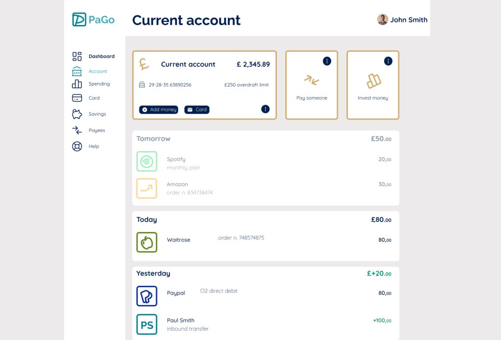
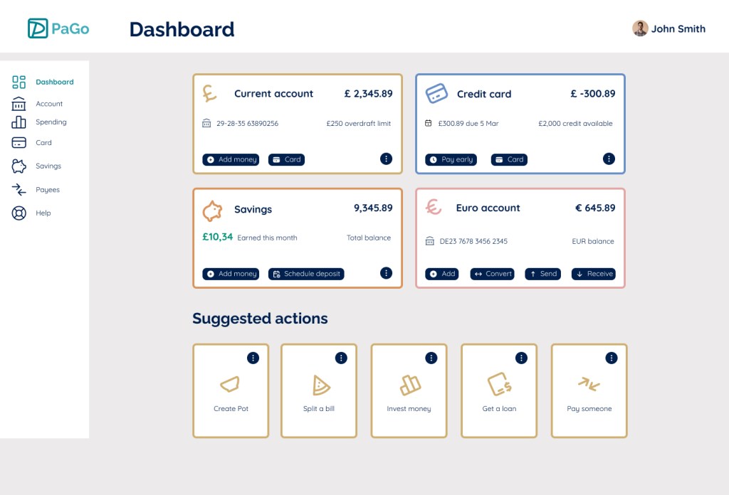
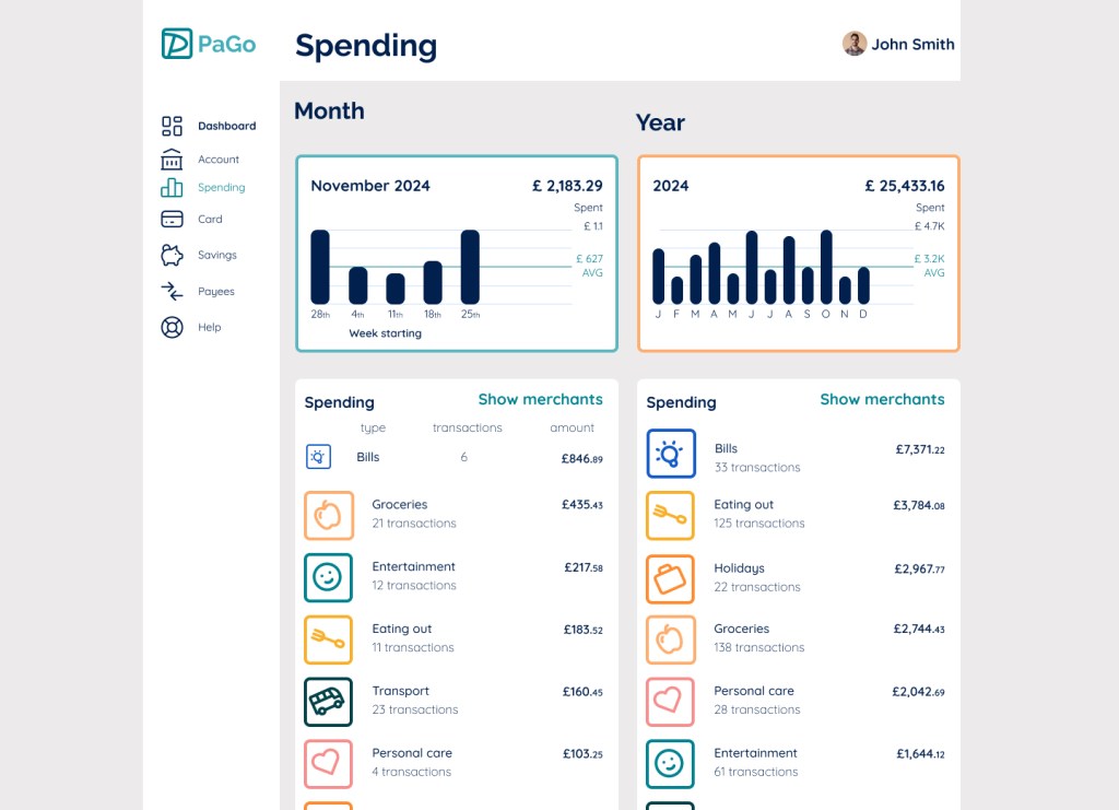
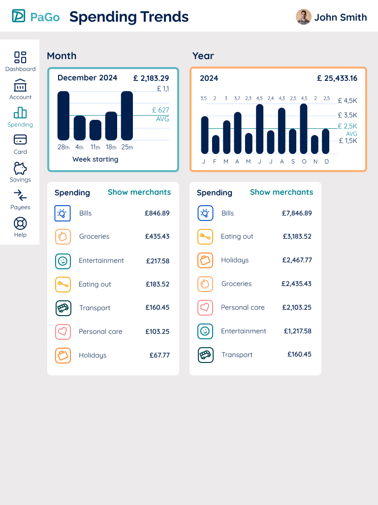
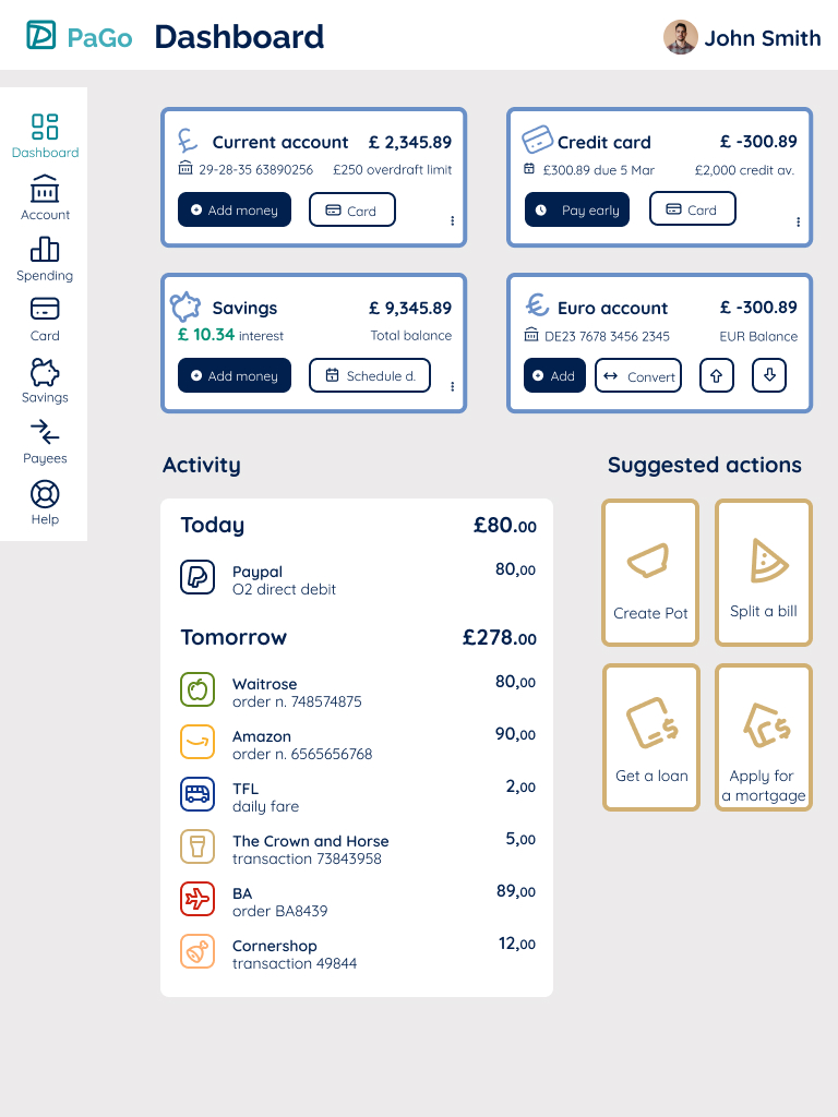
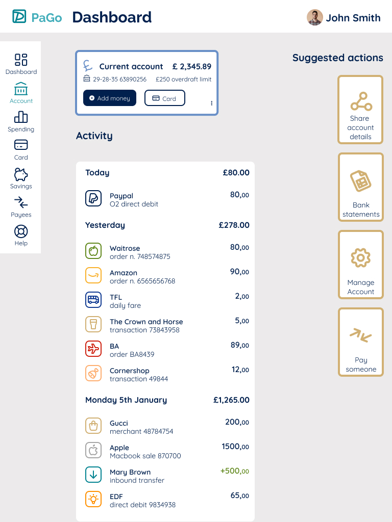
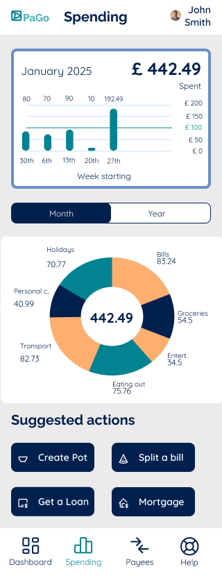
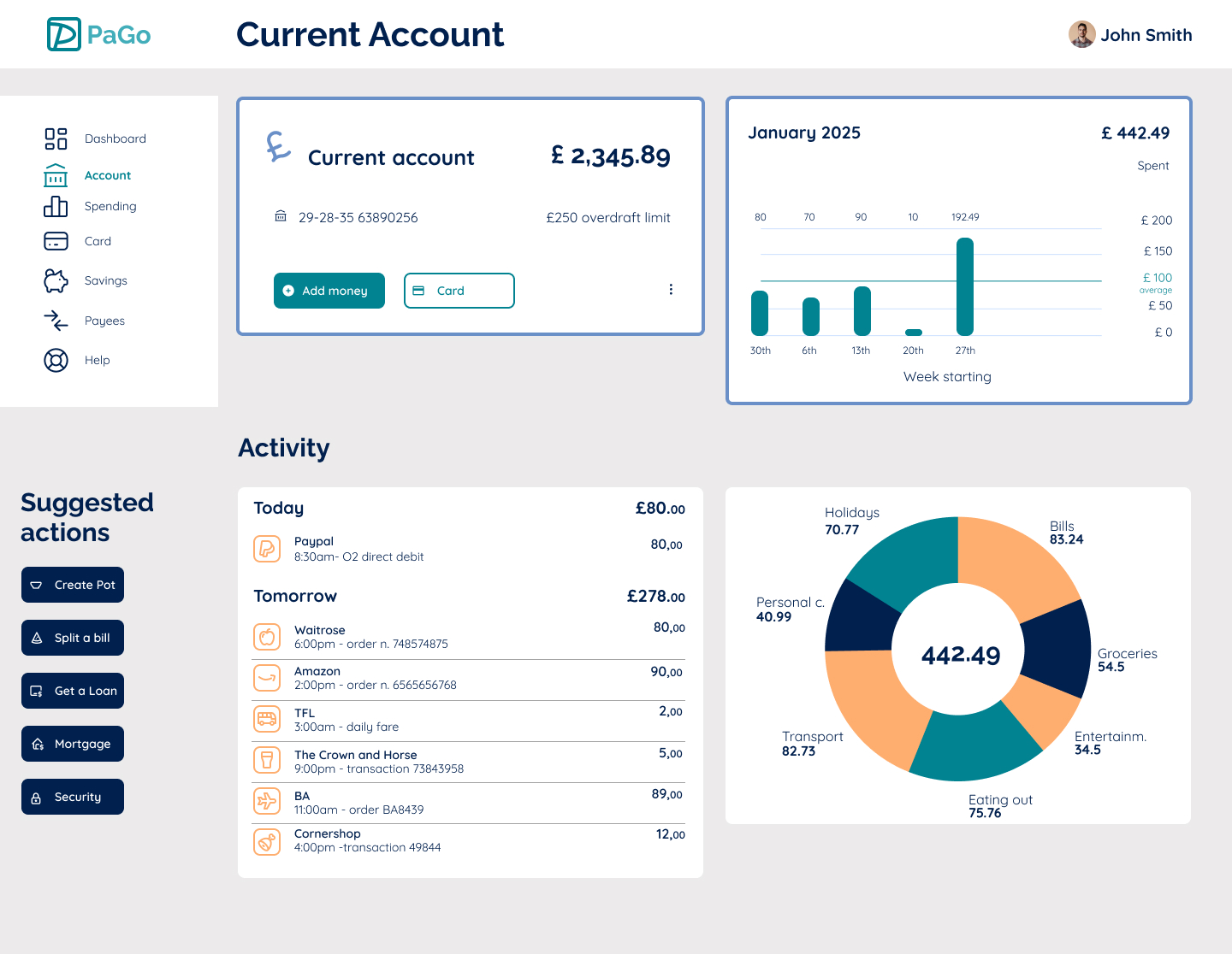
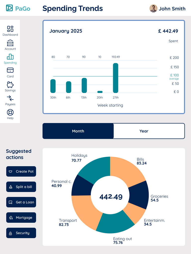
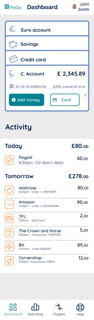
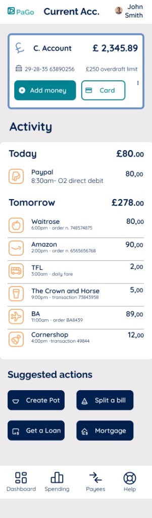
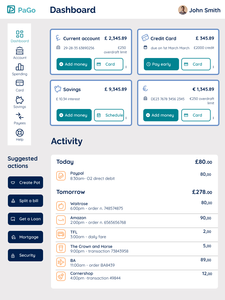
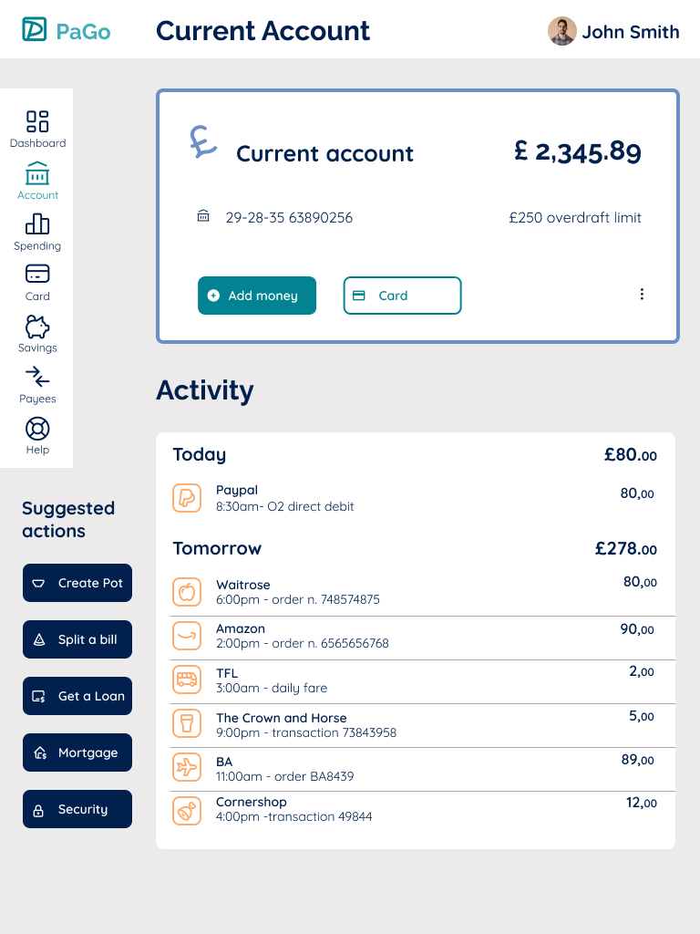
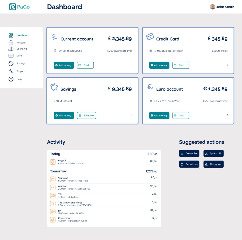
I designed a streamlined mobile interface with a focus on visual hierarchy, clear navigation, and accessible typography. The design uses soft colors and intuitive iconography to create a sense of security and ease. Features such as transaction overviews, spending categories, and quick actions were prioritized to help users stay in control.
My Contribution
- UX research and competitor analysis to identify pain points
- Wireframes and high-fidelity UI designs in Figma
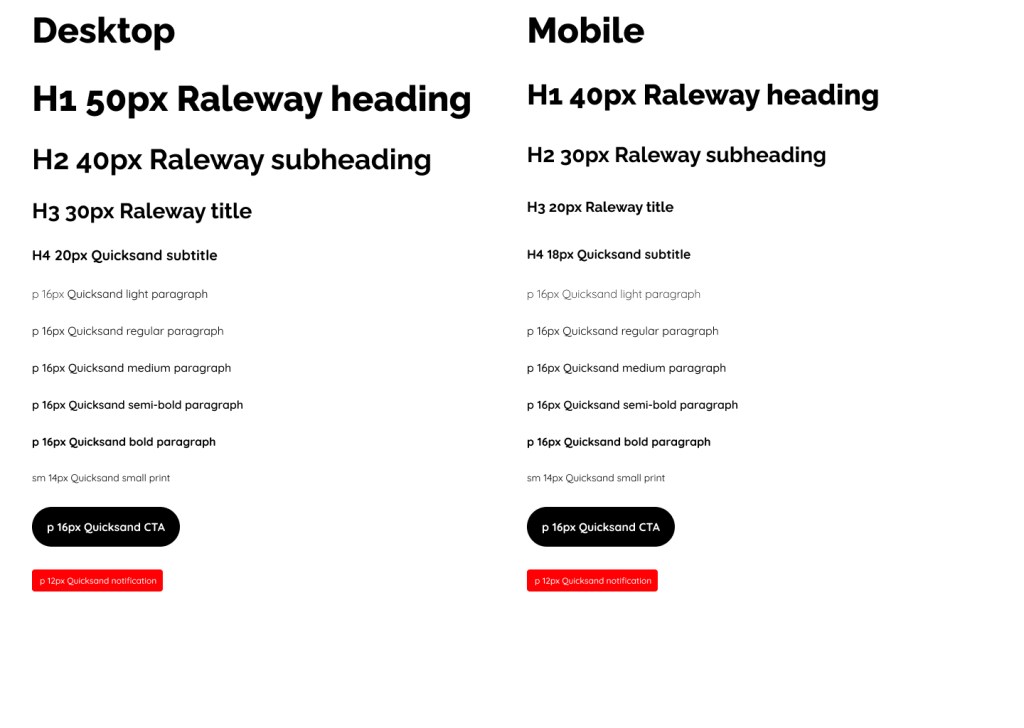
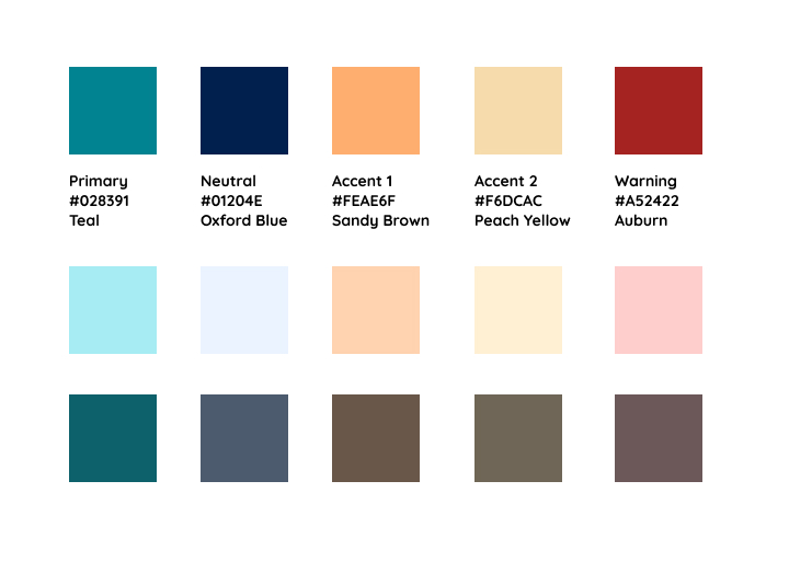
- Defined color palette, typography, and visual style guide
- Interactive prototype showcasing key user flows
Learnings
This project reinforced the importance of balancing aesthetics with functionality. I learned how subtle design choices — like color contrasts and spacing — can significantly improve clarity and user trust.


Results
The concept prototype was well-received in peer reviews for its clean layout and intuitive flow. It demonstrated my ability to translate complex financial tasks into simple, enjoyable digital experiences.
Typography
Color Palette:
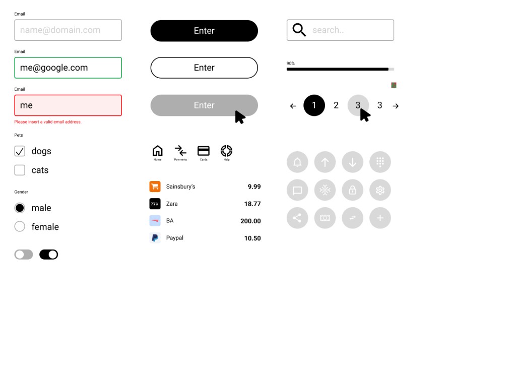
Component Library:
Iconography:
Iterations
Initial mock-up for desktop: dashboard, current account and spending screens.