
Website: casafiera.space
Inviting a sense of place and history—crafting a tranquil and authentic digital retreat for Casa Fiera.
Introduction & Client
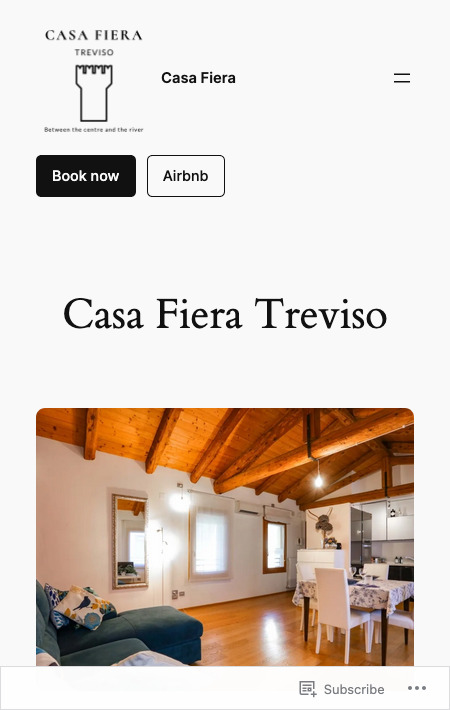
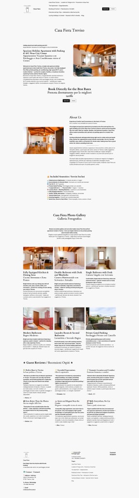
Casa Fiera is a charming vacation rental nestled in Treviso, designed to immerse guests in comfort, tranquility, and local heritage. The goal: build a brand and website that reflect its unique character, encouraging guests to discover, book, and connect emotionally with the property.
The Challenge
The project needed to:
- Evoke a deep sense of place tied to Treviso’s culture and landscape.
- Serve an international audience across devices, balancing beauty with performance.
- Guide visitors smoothly toward booking with clarity and warmth.
Solution
Research & Inspiration
- Analyzed the target audience and competitors to shape a standout positioning.
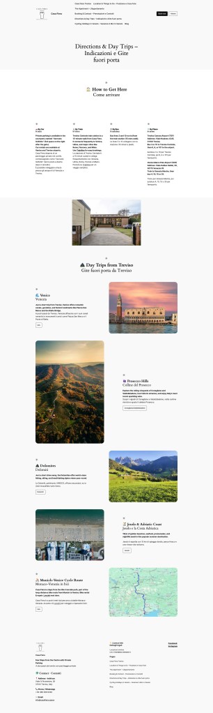
- Inspired aesthetic choices from the Prosecco Hills and the Sile River—translating those serene landscapes into the visual tone of the brand.
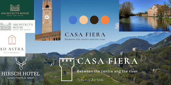
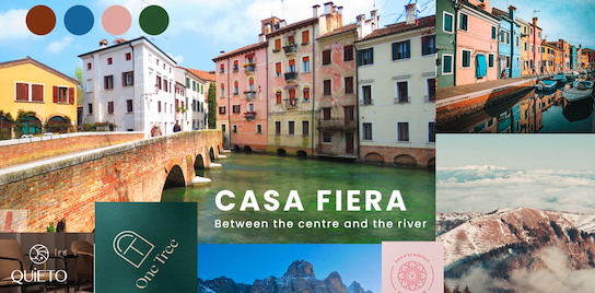
Branding
- Logo: Modeled after Treviso’s Torre Civica clock tower, grounding the brand in regional authenticity.
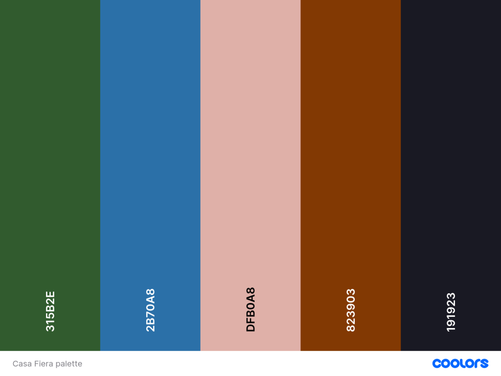
- Color Palette: Earthy greens, soft blues, and neutrals inspired by the natural surroundings of Casa Fiera, invoking calm and elegance.
- Typography:
- Headings: Cormorant Roma — a serif nod to Treviso’s Roman architectural heritage.
- Body: Lato — clean and highly readable for comfortable storytelling.
Website Structure & UX
- Designed an intuitive navigation: Home → About → Gallery → Amenities → Location → Booking.
- Integrated high-res imagery, an interactive map, and a booking widget, all wrapped in a responsive, mobile-first layout.
- Added clear CTAs and streamlined content to guide user flow toward booking.
Testing & Refinement
- Ran user-feedback sessions with prospective guests to refine usability and visual clarity.
My Contribution
- Initiated visual direction and branding through place-based storytelling.
- Designed logo, color palette, typography, and applied them consistently across digital touchpoints.
- Built the WordPress site to balance aesthetics, usability, and performance—especially for mobile users.
- Iterated based on guest feedback to fine-tune navigation, imagery, and user flow.

What I Learned
Combining local heritage elements with modern digital design creates a meaningful user experience—visitors feel an emotional connection, not just a transaction. I also reinforced how essential an intuitive yet beautiful booking journey is in hospitality digital design.
Results
- Strengthened brand identity that feels authentic, inviting, and regionally grounded.
- Visitors now enjoy a seamless experience from discovery to booking—especially on mobile.
- Positive feedback highlights the site’s visual charm and smooth navigation.

