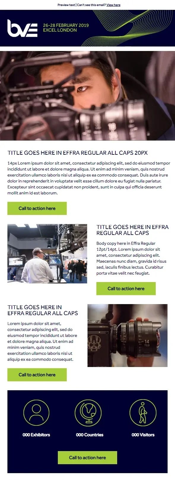
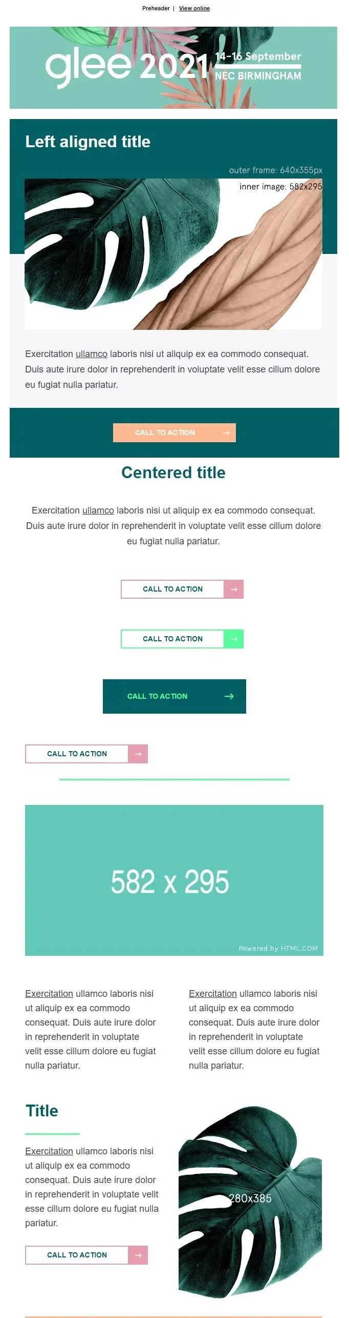
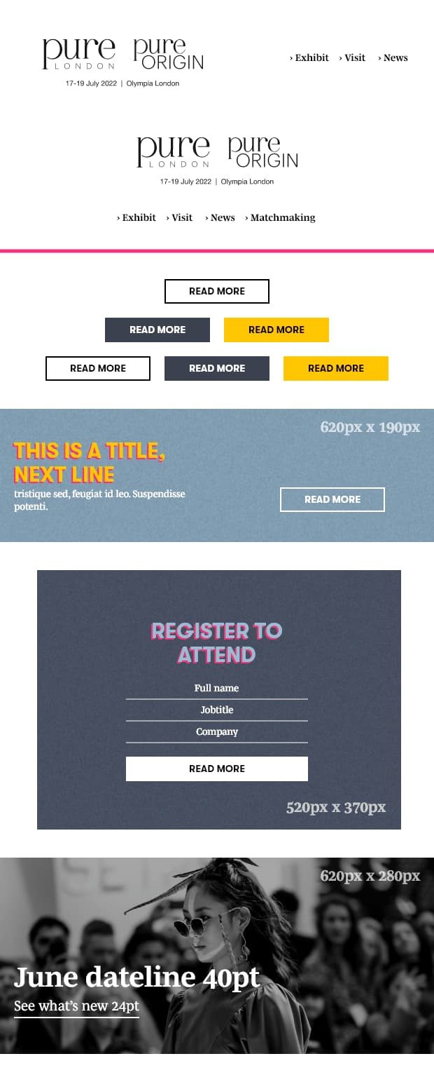
Hand-coded, not dragged and dropped. Modular, responsive templates tested across 30+ device and email client combinations, so they hold up in Outlook as well as they do on an iPhone.
12 years and 200+ campaigns for clients in automotive, financial services and events, built in Marketo and other ESPs, including kinetic and interactive work. Most of that volume was pure build: someone else’s design, made to render everywhere. That is the job.
The code is the constant. The ESP is just the wrapper.
The templates below are mine end to end, design and build, for Hyve Group event brands.

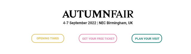
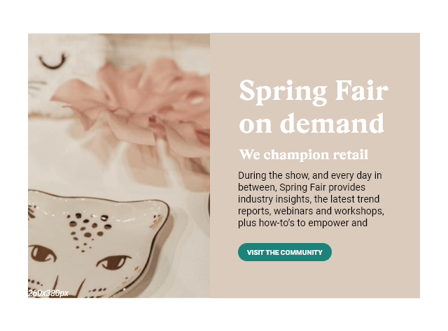
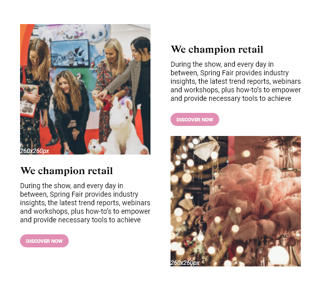
Autumn Fair: one master template, 29 modules
Role Design and build · Client Hyve Group · Platform Marketo · Year 2022
The situation
Hyve ran a portfolio of trade show brands, each with its own marketing team, its own audience and its own campaign calendar. Every one of them needed email, constantly: speaker announcements, exhibitor news, registration pushes, on-demand content. The pattern before this was that each campaign got briefed as a new build, which meant every email waited on a developer.
I was asked for a template. What the problem actually needed was a kit.
Three decisions
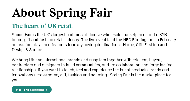
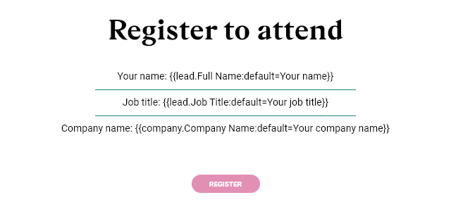
Modules over layouts. Rather than design an email, I designed 29 blocks that assemble into one: navbars, hero CTAs, two- and three-column grids, a testimonial, quick links, a newsletter block, a footer. A marketing manager picks blocks in the order the story needs. Nobody designs an email again, they compose one.
Every setting scoped to the module, not the email. This is the decision that made it reusable across brands. 32 of the 33 template variables are module-scoped, so the same three-column block can be teal in one email and pink in the next, with its own button widths and its own spacing. One template covers a portfolio of brands with different palettes instead of one brand with one.
Spacing as a variable, not a margin. Top, middle and bottom spacers are table rows with variable heights, exposed to the marketer as sliders. It looks like a small thing. It is the reason the emails do not collapse in Outlook, and the reason a marketer can tighten a layout without asking anyone.
How it was built
Hand-coded. 103 nested tables, one 640px breakpoint, and 24 Outlook-only conditional blocks carrying 23 VML buttons so that rounded corners survive in Outlook without becoming an image. mso-line-height-rule:exactly on every text cell, because Outlook otherwise invents its own line height. A three-format webfont stack with a system fallback. Personalisation tokens with default values, so a missing first name degrades to “Your name” rather than to nothing.
<div><!--[if mso]> <v:roundrect xmlns:v="urn:schemas-microsoft-com:vml" href="${ButtonLink1}" style="height:40px;v-text-anchor:middle;width:${CTAwidth2};" arcsize="67%" strokecolor="${PrimaryBgColor}" fillcolor="${PrimaryBgColor}"> <w:anchorlock/> <center style="color:${FontColor};font-family:sans-serif;font-size:12px;font-weight:bold;">${ButtonText1}</center> </v:roundrect><![endif]--><a class="cta" href="${ButtonLink1}" style="background-color:${PrimaryBgColor};border-radius:20px;color:${FontColor}; display:inline-block;line-height:40px;width:${CTAwidth2};mso-hide:all;">${ButtonText1}</a></div>
Outlook renders the VML rectangle and hides the anchor. Every other client hides the VML and renders the anchor. Both read their colour, width and label from the same three template variables, so a marketer changing the button in Marketo changes both versions at once. Twenty-three of these in the template.
<td style="line-height:${MiddleSpacer};font-size:${MiddleSpacer};" height="${MiddleSpacer}"> </td>
Vertical spacing is a table row with a variable height, not a margin, because Outlook ignores margins. The marketer gets a slider from 1 to 300px. Outlook gets a table cell.
The result
The template shipped as a kit rather than a campaign, and the marketing teams behind Autumn Fair, Spring Fair, Glee, BVE Expo and Pure London assembled from it instead of briefing new builds. Across the group that covered 10+ trade show brands and 20+ event sites.
Open and click rates sat with the campaign teams rather than with me, so I won’t quote figures I didn’t own. What I can point to is the thing I was hired for: a set of blocks the business kept using, hand-built so they rendered correctly everywhere.
What I’d do differently
Two things, both of which are standard now and were not part of our workflow in 2022.
Dark mode. There is no prefers-color-scheme handling in this template and no [data-ogsc] fallback for Outlook.com. In 2022 that was survivable. Today it is the first thing I’d build in, because a logo that vanishes against an inverted background is the most common broken email I see.
Accessibility. 31 image slots and only 11 alt attributes, and no role="presentation" on the layout tables, which means a screen reader announces 103 tables it should be ignoring. Both are cheap to fix at build time and expensive to retrofit. I build them in as standard now.
Other templates